UI Customisation

Themes & Homepages

Kwirth's look and feel is fully pluggable. Install themes to change the visual identity of the entire shell, or swap the homepage for one that shows exactly the cluster data you care about.

Themes

Pluggable UI themes

A theme is a self-contained package — a React component plus a manifest — that overrides the colour palette, typography, and component styling of the entire Kwirth shell. Themes are installed, switched, and removed at runtime with no pod restart.
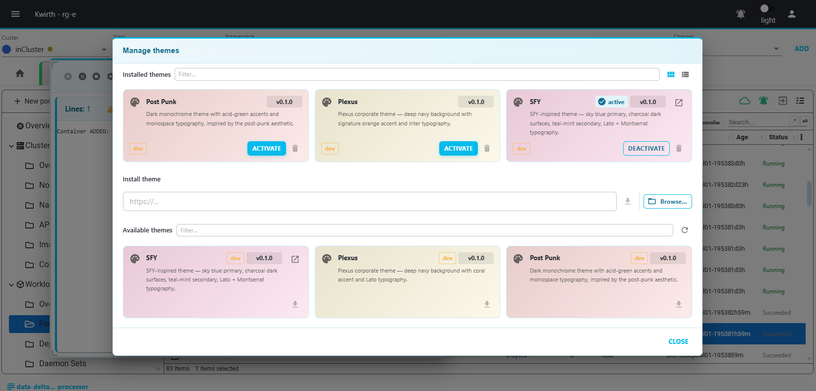
ThemeManager dialog showing installed themes
Default
Default
The standard Kwirth look. Dark navy background, orange accent, clean sans-serif type. Ships with the core and cannot be removed.
Default
post-punk
Post-Punk
High-contrast neon-on-black aesthetic. Hot-pink accents, monospaced everywhere, and scanline-style horizontal rules. Inspired by 80s CRT terminal art.
Built-in
plexus
Plexus
Deep-space blue palette with electric-blue accents and subtle radial gradients. Designed for large displays in a NOC or operations room.
Built-in
SFY
SFY
Science-fiction purple-and-violet palette. Deep black backgrounds, glowing violet highlights, and subtle bottom-lit gradients.
Built-in
Matrix
Matrix
Pure black background with phosphor-green (#00ff41) accents. Full monospace typography (IBM Plex Mono) across all UI elements, dark-green borders, and green-tinted scrollbars.
Built-in
Avicii
Avicii
Gold (#c9a227) on near-black with warm parchment light mode. Oswald condensed typography, sharp zero-radius corners throughout, and gold top-border accent on all cards and dialogs.
Built-in
Depeche Mode
Depeche Mode
Blood-red (#C4303A) accents on warm abyss-black, with a creamy parchment light mode. Barlow Condensed / Impact typography, left crimson border on cards, and full dark/light dual-mode palette.
Built-in
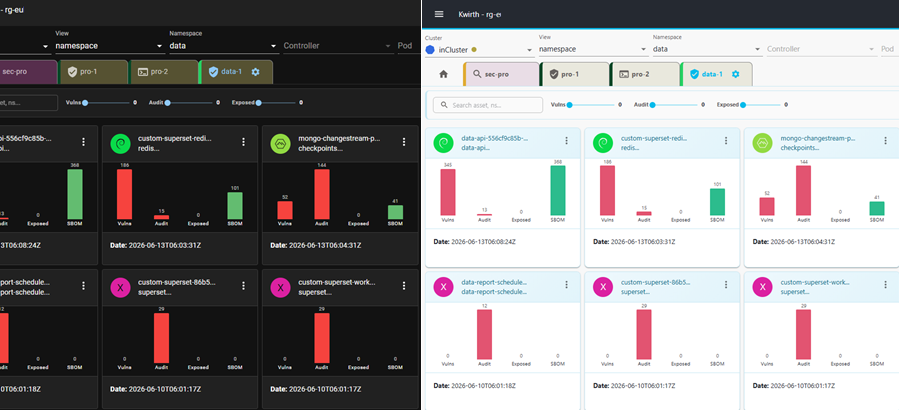
Default theme vs post-punk theme comparison

Switching themes

Open the global menu (top-right) → Themes. The ThemeManager dialog lists all installed themes with a live preview chip. Click the radio button next to a theme and the shell repaints instantly — no page reload, no connection interruption.
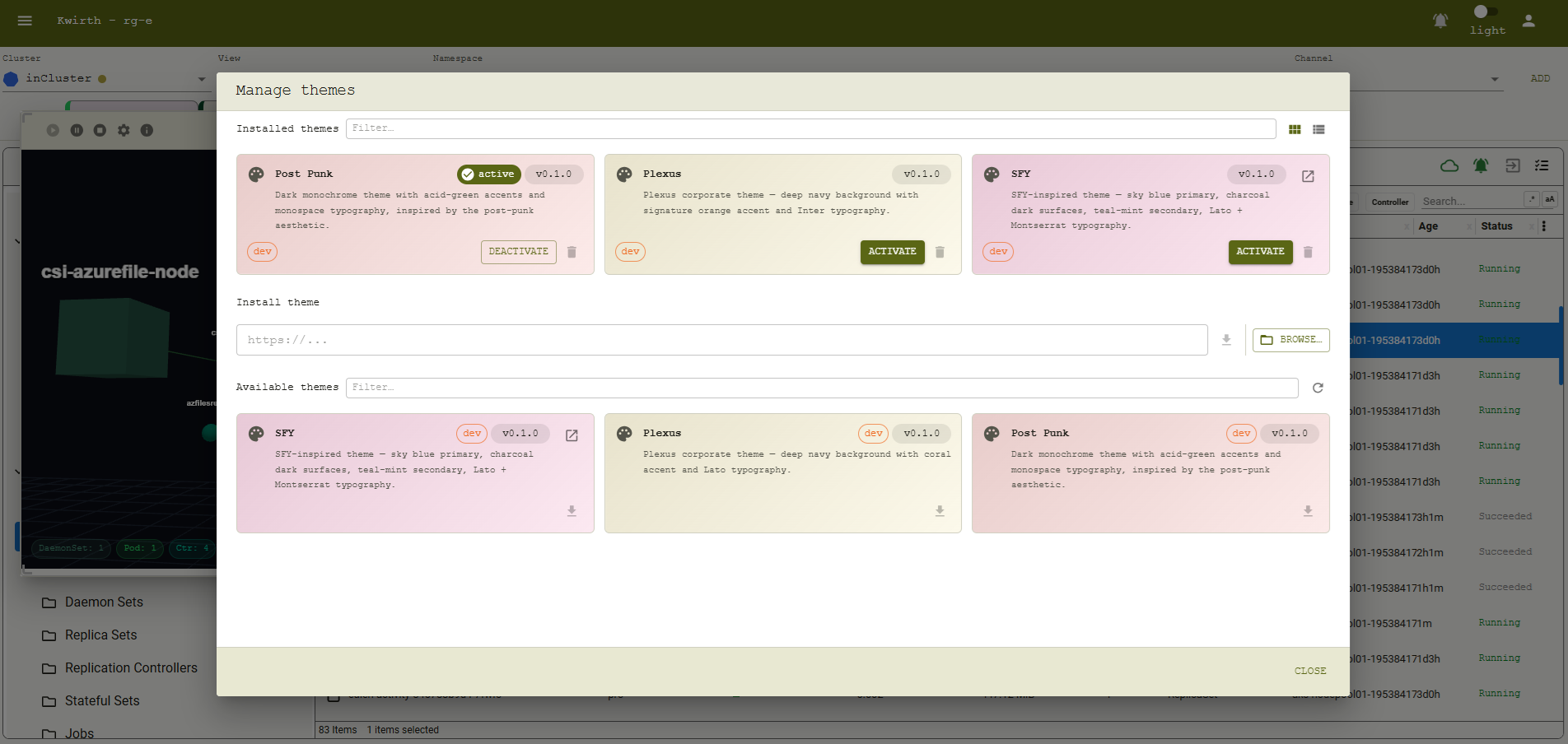
Switching themes live in the ThemeManager
Homepages

Pluggable homepages

The homepage is the first thing you see after login. It is a pluggable React component that receives live cluster data, event streams, and metrics as props — you decide what to show and how.

Basic
Basic — default
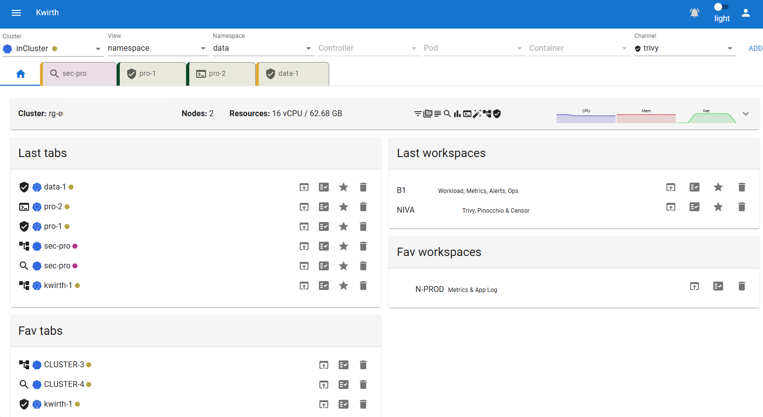
The classic Kwirth homepage. Shows a card per connected cluster with sparkline charts for CPU, memory, and network usage, plus last-used and favourite tabs and workspaces.
CPU / memory / network sparklines (live, last 60 s)
Last-used and favourite tabs & workspaces
One-click restore of any saved tab or workspace
MATRIX
Matrix
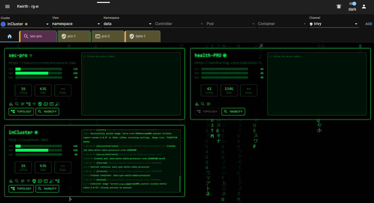
A green-on-black homepage inspired by the Matrix digital rain. Each cluster gets a card with a live canvas rain animation, real-time CPU/MEM/POD utilisation bars, a live cluster event log, and quick-launch buttons for installed channels.
Live Matrix rain canvas per cluster card
CPU, MEM, POD utilisation bars with unicode block rendering
Live cluster event log (newest at bottom, auto-scroll)
Connectivity indicator (green pulse = online, red = offline)
Quick-launch buttons for Topology and Magnify channels
AVICII
Avicii
Minimalist gold-on-black homepage inspired by the Avicii visual identity. Each cluster card features a gold top-border accent, rhombus metric bars (▰▱) for CPU/MEM/POD, mini stat cards for vCPUs, RAM and pods, and a pulsing gold diamond connectivity indicator.
Gold rhombus metric bars (▰▱) for CPU, MEM, POD — width adapts to card size
Mini stat cards for vCPUs, total RAM and running pods
Pulsing gold diamond connectivity indicator per cluster
Avicii two-triangle logo and SVG wordmark in the header
EXPLORE quick-launch button for Magnify channel
DEPECHE MODE
Depeche Mode
A dark/light dual-mode homepage with blood-red accents and a cross-hatch diagonal background. Adapts automatically to the active Kwirth theme. Each cluster card shows live ASCII history charts for CPU and MEM, with a left-side crimson border accent and a STRANGELOVE quick-launch button.
Dark and light mode support — adapts to the active Kwirth theme automatically
ASCII history charts for CPU and MEM (last 20 samples)
Cross-hatch diagonal background pattern in blood red
Blood diamond connectivity indicator per cluster
STRANGELOVE quick-launch button for Magnify channel
Basic homepage with cluster sparklines Matrix homepage with live event log and utilisation bars Avicii homepage with gold rhombus metric bars and mini stat cards Depeche Mode homepage with ASCII history charts and blood-red accents
Extensibility

Build your own theme

A theme package contains two files: a manifest and a React component. The component receives a ThemeProvider children prop and wraps it with any MUI or custom style overrides you need.

1

Create the manifest

Add a package.json with kwirth.type = "theme" and a unique kwirth.id.

2

Implement ITheme

Export a default React component that satisfies ITheme. Wrap children with an MUI ThemeProvider using your custom palette.

3

Bundle and install

Run npm pack to produce a .tgz. Upload it through the ThemeManager dialog — Kwirth hot-loads it immediately.

// package.json (excerpt)
{
  "name": "my-theme",
  "kwirth": {
    "type": "theme",
    "id":   "my-theme",
    "displayName": "My Theme"
  }
}

// src/index.tsx
import { createTheme, ThemeProvider } from '@mui/material'
import { IThemeProps } from '@kwirthmagnify/kwirth-common-front'

const theme = createTheme({
  palette: {
    mode: 'dark',
    primary: { main: '#your-accent-color' },
  }
})

export default function MyTheme({ children }: IThemeProps) {
  return <ThemeProvider theme={theme}>{children}</ThemeProvider>
}
Extensibility

Build your own homepage

A homepage package exports a React component that receives clusters, live metrics, event helpers, and navigation callbacks as props via IHomepageProps. The Kwirth shell handles authentication, data fetching, and prop injection — your component just renders.

1

Create the manifest

Add a package.json with kwirth.type = "homepage" and a unique kwirth.id.

2

Implement IHomepageProps

Export a default React component typed as FC<IHomepageProps>. Use props.getClusterMetrics() and props.getClusterEvents() for live data.

3

Bundle and install

Run npm pack and upload the .tgz via the Homepage section of the Kwirth settings panel.

// src/index.tsx
import { FC, useEffect, useState } from 'react'
import {
  IHomepageProps, IClusterEvent
} from '@kwirthmagnify/kwirth-common-front'

const MyHomepage: FC<IHomepageProps> = (props) => {
  const [metrics, setMetrics] = useState<any>({})

  useEffect(() => {
    props.clusters.forEach(async (c) => {
      const m = await props.getClusterMetrics?.(c.name)
      if (m) setMetrics(prev => ({...prev, [c.name]: m}))
    })
  }, [props.clusters])

  return (
    <div>
      {props.clusters.map(c => (
        <div key={c.name}>
          <h2>{c.name}</h2>
          <p>CPU: {metrics[c.name]?.cpu ?? '--'}%</p>
        </div>
      ))}
    </div>
  )
}
export default MyHomepage

Available props at a glance

clusters — array of connected cluster objects including URL, access string and kwirthData
frontChannels — Map of installed channel constructors, for rendering channel icons or launching channels
getClusterMetrics(name) — async, returns CPU%, MEM%, POD%, vCPUs, total RAM, pod counts
getClusterEvents(name, limit?) — async, returns last N cluster events with time, type, reason, message
lastTabs / favTabs — recently used and favourited tabs for restore shortcuts
isExtensionLicensed(type, id) — check whether a specific extension is licensed for this instance